- This topic has 17 replies, 7 voices, and was last updated 12 years, 5 months ago by
fatherbowdern.
-
AuthorPosts
-
May 18, 2013 at 5:32 AM #14168
Jason Stringer
KeymasterAn exhibition showcasing movie poster designs rejected by Hollywood studios over the years features two rare Exorcist posters.
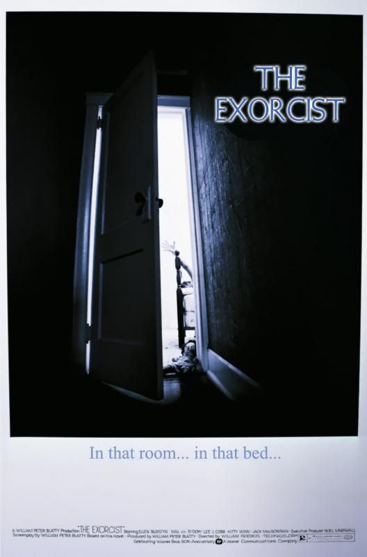
It's hard to imagine The Exorcist being promoted without the iconic image of Father Merrin stepping out of that Georgetown cab and walking into the beam of light from Regan's window, but Warner Brothers almost went in a different direction.

Designed by graphic artist Bill Gold, who began working for Warner Brothers art department in 1942, the two posters are part of a gallery at Daybees.com which also includes rejected designs for movies such as Unforgiven, A Clockwork Orange, Batman, and Pulp Fiction.
The first (my favourite, as seen above) depicts Regan's bedroom door cracked open from a low angle, hinting at the evil that lurks within. The other, a much simpler composition (see below), shows a smiling Linda Blair in a wholesome photo album picture with the caption “Deliver her from evil.”
I find the most glaring deterrent for these rejected posters is the unusual choice of typeface used for “The Exorcist” title. It's more wholesome than eerie and doesn't reflect the film well. Of course, it's easy to say after the film's success and being so used to seeing the “Merrin arrives” designs.
 May 18, 2013 at 6:42 AM #27389
Justin
ParticipantI can imagine audiences getting an even bigger shock had they actually gone with that second poster, which makes it looks like a light family film. It goes perfect with this:
I believe the first one was used for the premiere broadcast on CBS. There were a couple of ad clippings floating around on eBay a few months back which had that and another similar looking design on them.
May 18, 2013 at 7:10 AM #27390KeymasterOkay… how the Hell (pun intended) have I never seen that trailer before?? It's even Australian!
You're right Justin, the second “Deliver her from evil” white poster especially, would have left audiences completely unsuspecting of the terror that was set to unfold.
I recall seeing black and whites of that door creaked open. That image probably would have been more compelling in the 70s and not-yet as cliché as it is now. Thankfully they settled on “Merrin arrives.”
May 18, 2013 at 7:34 AM #27391ParticipantI recall seeing black and whites of that door creaked open. That image probably would have been more compelling in the 70s and not-yet as cliché as it is now. Thankfully they settled on “Merrin arrives.”
You mean this?

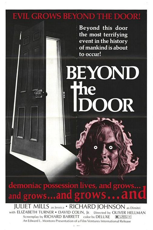
The ’74 rip-off Beyond The Door used a very similar image:
The ads I saw on eBay were identical to the colour poster, though, with the dodgy typeface and all. I think there was also one with priests in it. I assumed they were made specifically for CBS and would have bought them if I knew they were actually the original poster designs.
May 18, 2013 at 9:17 PM #27392ReganMacNeilfan
ParticipantWould be great to have these made for the 40th anniversary.
May 18, 2013 at 9:20 PM #27393ParticipantI can imagine audiences getting an even bigger shock had they actually gone with that second poster, which makes it looks like a light family film. It goes perfect with this:
I believe the first one was used for the premiere broadcast on CBS. There were a couple of ad clippings floating around on eBay a few months back which had that and another similar looking design on them.
Anyone else hear dogs barking and other odd sounds during this vid? Or is my iPad possessed? Lol
May 20, 2013 at 12:02 AM #27396GhettoExorcist
ParticipantWow I really like that first one. However, I do agree the font is terrible and almost jokey. I like how it hints at something very horrific with a small view of a hand reaching up. If the image that they ended up going with wasn't so powerful, this would have been a great poster.
The second one is very misleading and doesn't really get anything across as far as tone or atmosphere of the film.
May 24, 2013 at 2:35 AM #27410fatherbowdern
ParticipantDoes anybody else have a skewed screen on this particular post? Mine is cut off on the right-hand side. Bummer.
Father B
May 24, 2013 at 10:51 PM #27412granville1
ParticipantYes, this page has been skewed/cut off every time I've visited it for the past few days.
May 24, 2013 at 11:03 PM #27413ParticipantSame for me. But is fine on my iPad.
May 27, 2013 at 8:36 PM #27420ParticipantOh, well. Would have been nice to have really read this without me filling in the words on my own. 🙂
Father B
May 28, 2013 at 7:36 AM #27417KeymasterFather B, I've made some edits to my original post which should now make it readable. Apologies for the technical hiccup. A new forum layout is on the way!
May 28, 2013 at 5:12 PM #27431ParticipantThanks for the fixes, Cap'n 🙂
May 29, 2013 at 7:30 PM #27435ParticipantCaptain Howdy said:
Father B, I've made some edits to my original post which should now make it readable. Apologies for the technical hiccup. A new forum layout is on the way!
Thanks, Jason! I'm glad I can read everything and I look forward to a new design.
The first poster is pretty good if it had to be chosen even though the font is horrible (and I remember pretty much everything back then used these “comic sans” type of fonts). Although the door doesn't match the one in the film and the Raggedy Ann has nothing to do with it, the design is clever for a graphic artist that probably was given very limited information.
Father B
June 2, 2013 at 2:24 AM #27451etrigan69
ParticipantChanged the font on the 1st one. I like it better….
-
AuthorPosts
- You must be logged in to reply to this topic.