- This topic has 2 replies, 3 voices, and was last updated 12 years, 10 months ago by
Jason Stringer.
-
AuthorPosts
-
August 5, 2013 at 3:03 AM #14205
HITSOHARD
ParticipantHi all!
So I'm currently taking a design class and I'm planning on using this for my next assignment which has an awkward 30'x14' requirement (I'll just pretend they still do that for some alternative film posters.) I read this forum a lot even though I just registered today and no one knows the Exorcist like you guys. So I needed an critique on this poster, any things you might want to see different or changed within the poster.
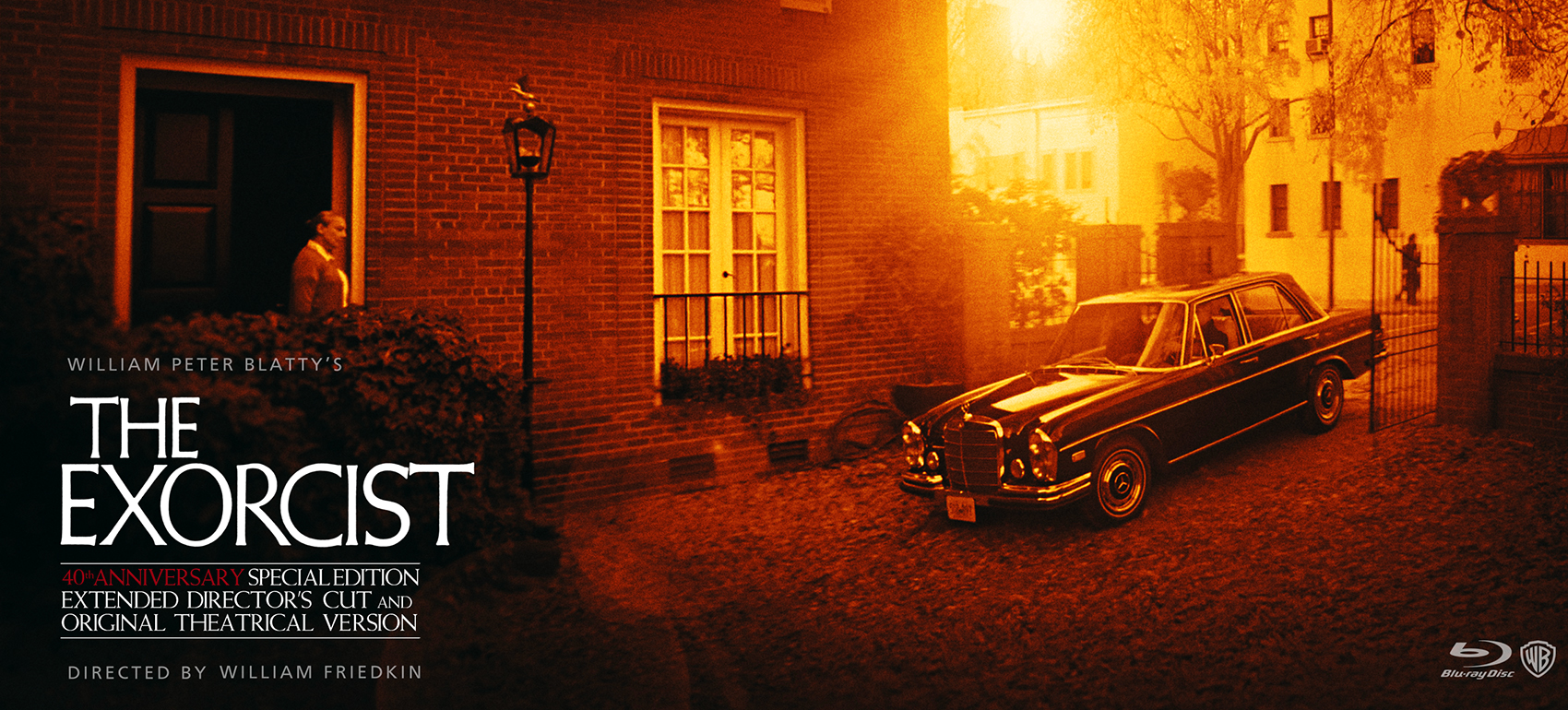
I chose the scene of Chris and Regan driving home after the doctors had pretty much told her there were no options left except to seek something beyond the physical realm. I think the scene was simply meant to be just a transition, however, I absolutely love how beautifully intimate and hopeless it feels. Chris has all the support she can get with her staff but it just doesn't matter. The actors are excellent, music is great and it's shot beautifully (Friedkin really is a genius.)
I took the stills from the scene with the car pulling in and stitched them together to create a wider image. I felt that there were many dark blue and green versions of the artwork already, so I chose a more analogous selection of red, orange and yellow.
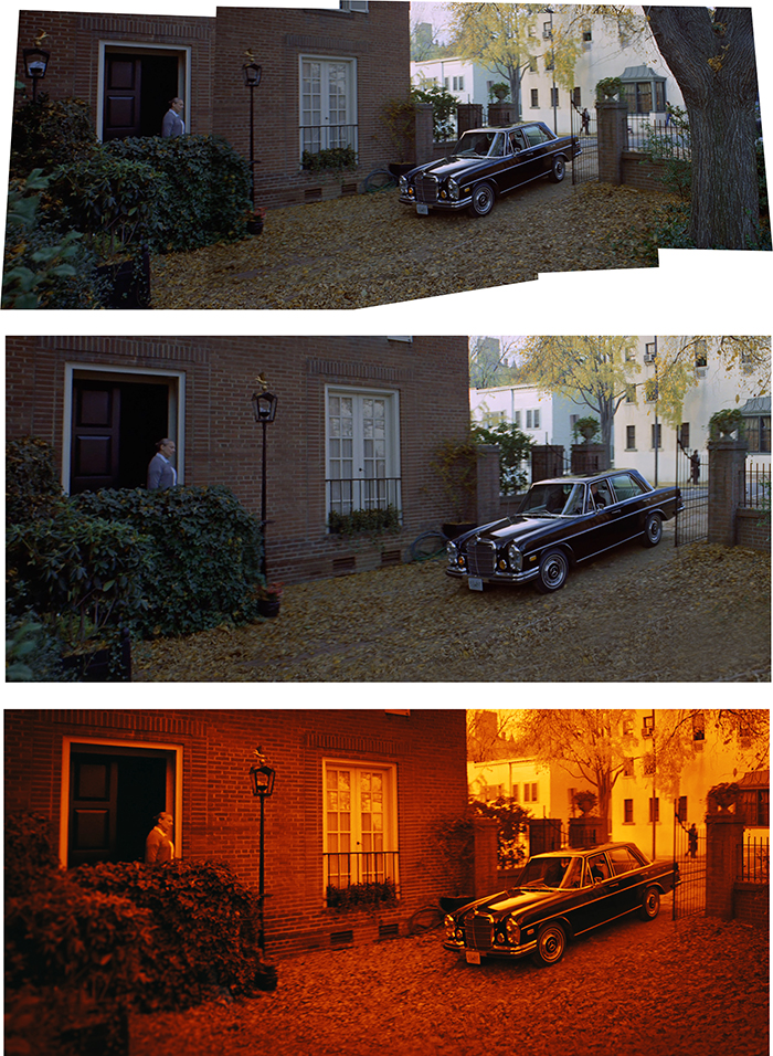
I tried to create a contrast of light and dark that really exists in the film, so I made one edge seem dark as the sun shines its rays of light from the other side. Then added the text, shadows and highlights and so on. Please feel free to give me any help to make this better. Feel free to nitpick. Thanks all!
 August 5, 2013 at 9:15 PM #27673
fatherbowdern
ParticipantPersonally, I like your color choice and the way in which you altered the colors. There are so many of the blue and green tones that you speak of with The Exorcist artwork. I really don't have anything to “nitpick” because the scene makes sense to me.
Are you asking if the scene will make sense to a novices or someone who has seen the film (perhaps individuals in your design class)?
Oh, and welcome!
Father B
August 6, 2013 at 4:09 AM #27676Jason Stringer
KeymasterNice work, and welcome to the forums.
Your explanation for using that scene as inspiration certainly helped make sense of the poster. As an overall piece to be hypothetically used to promote The Exorcist, I'm not sure it would reach out beyond fans of the film, which it'd be expected to do.
Apart from that, I really like what you've done with it. I think it has great tone and sets a sullen mood.
-
AuthorPosts
- You must be logged in to reply to this topic.