etrigan69 said:
Changed the font on the 1st one. I like it better….
 etrigan69 said:
Changed the font on the 1st one. I like it better….
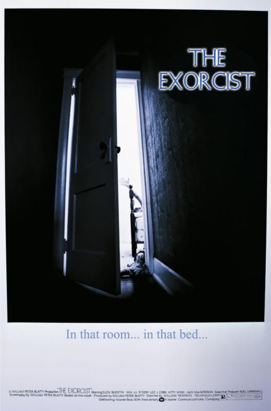
etrigan, it's much better! I wonder what this poster would have looked like had it been more related to the film; e.g., the actual door (an overly popular Colonial “Bostonian” style implying a crucifix) that opens in vs. out; losing the Raggedy Ann doll altogether (it was too young for Regan); and, instead of Regan's hand that's reaching upward (which means Regan is actually poised at the footboard and is more awkward), displaying her legs and a part of her nightgown while she's levitating?
I think the artist was on track for something that he hadn't seen. In fact, he may have had to work from a script of just background information (like the novel) to work from. It is an interesting alternative choice if Merrin hadn't been chosen.
Father B
.